Revenge of the "T-House"


The creepy metal house I blogged a while ago was brought back to my attention by my uncle who’s a more adept Googler than me.

He found out this:

Built in the early 90s by architects Simon Ungers and Tom Kinslow, the house belongs to a writer and houses a 10,000 volume library. It’s clad in heavy steel with a nickel and chromium finish. The top bar of the “T” (44′ x 12′ x 16′) contains the library.

Excerpted from The Architectural Record, full entry here.

Maybe it’s not as evil a house as I thought….still I wouldn’t turn my back on it.

…Just Dynamic Tension

.flickr-photo { border: solid 2px #000000; }.flickr-yourcomment { }.flickr-frame { text-align: left; padding: 3px; }.flickr-caption { font-size: 0.8em; margin-top: 0px; }

They Got Their Kicks from Forbidden Feats of Strength

Most men fall in love with women. But some men fall in love with themselves–men like the weight-lifters of muscle beach.

For these body worshippers, their physique is their fortune. Whether it’s being exhibited performing feats of strength, or leered at in glossy photos by thrill-seekers of every sex and taste, there’s big money in those biceps. And it’s often dirty money!

Teen-ager Jerry carpenter found that out when he, for kicks and vanity, got himself involved in the sordid dealings of a notorious photographer and the strange characters that surrounded him.

What you’ve heard about in whispers is frankly, startlingly revealed in MUSCLE BOY, a novel that bares the naked truth about the Beefcake Kings.

———

Wow! It would take a “forbidden feat of strength” to keep me from reading this.

Mountain of Paperbacks

The floor by my desk is blessedly clear since I conquered the huge buy of vintage pbs I’ve been tripping over for weeks.

Some decent stuff. A first pb of Highsmith‘s Strangers on a Train, another copy of Felsen‘s Fever Heat, some Nightstand/Evening Reader/Leisure smut, Charles WilliamsAll the Way, an Eric Stanton cover and lots more.

Most of them were common but I got some great scans for my cover gallery (If you saw a book you like but don’t see it for individual sale, watch for it in my PB lots in the coming week or two).

A book with an isbn or barcode would be a sight for sore eyes right now. I think I typed frakkin War and Peace, three times over.

Unfamiliar Armed Services Edition

Just found this special discount sticker for men in uniform on a digest-size paperback of Erle Stanley Gardner’s Murder Up My Sleeve (Bestseller Mystery / Lawrence E. Spivak B29). I’ve seen many variations on the ASEs but this is the first time I’ve encountered a sticker as an indicator. I wonder if this is the way they were “remaindered” since these were digests instead of mass markets?

Jim Palmer – Hard-Boiled Regency Cop

Since everyone seems to like my galleries of pulp fiction art and book eye-candy, I thought I would start another set covering the dark side of book design. This set will include the most crap-looking books I can find.

I’m not going to dig through my stacks or anything (because that would take more effort than was expended creating these atrocities) but as they find me, I’ll share the horror.

My first entry is Die, Lover by Harry Whittington (Uni Book / Modern Promotions 1960). This cover would probably warrant inclusion for its badly printed, sub-Kincaidian painting alone, but when you read the copy (click image for larger version) you realize this art has absolutely nothing to do with the text. The cover features two pensive-looking, courtly lovers, traipsing about a dewy country estate; the book inside is about a tough cop driven by a lust for revenge.

So wrong genre, wrong historical period by century or two…nicely done Uni Book. I’ll keep my eyes peeled for your fine publications.

Altered Books

Usually any changes an owner makes to a book are cringe-inducing: inane inscriptions scrawled with a sharpie, underlining every sentence on a page, “yes!!!” declaimed in the margins…

I could do a whole series of posts on egregious sins committed against a book (in fact I think I will. Like the Gatsby 1st I sold with a modern phone number inked on the flyleaf. Grrr).

But this post is about those rare occasions when a book is altered in a good way: Interesting clippings (or ephemera) layed-in, evocative and revealing inscriptions (in pencil), helpful corrections to a plan or recipe. Additions that increase your appreciation or the usefulness of a book.

I saw a term for this once. “Babbittism”, I think? It ain’t Googling so I probably have it wrong. It was definitely taken from the name of a character in an American fiction classic, likely by Sinclair Lewis….(little help?).

Anyway here are a couple of my favorite examples:

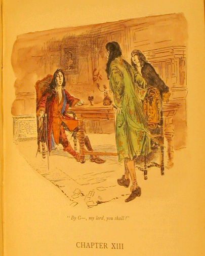
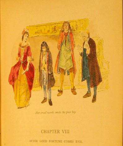
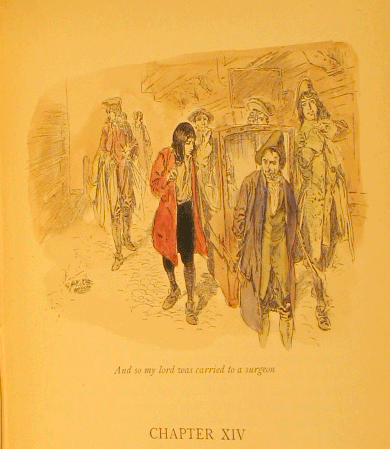
First, a nice 1896 edition of Thackery’s History of Henry Esmond in which all of the plates (by artist T. H. Robinson) have been neatly and skillfully hand painted in what looks like water color or some kind of ink wash:


Nice, right? A well-chosen color palette, texture highlights in the clothing, subtle tone variation. This person could “colorize” all my books.

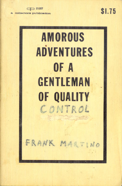
Next a plain and anonymously written pseudo-Victorian sex memoir entitled: Amorous Adventures of a Gentleman of Quality altered by a co-worker to make a bawdy bachelor party or going-away present.

I hope you had a fun night Mr. Frank Martino.

Anyone have any other examples of books artfully altered?